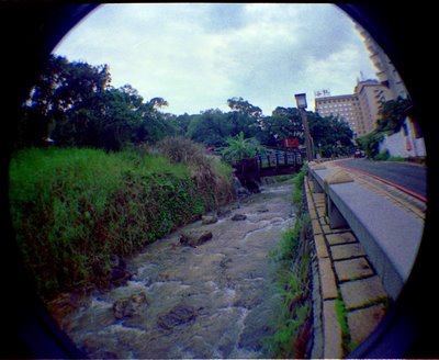
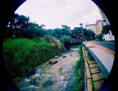
Unfortunately, "better" is relative, and there is such a difference in the actual quality of the scans that there are some things I like about the commercial scan, and other things I like about the home scan. It's been a quandary, ergo I haven't posted any yet.
I don't intend to do this with the whole roll, I hope, but here are the comparisons:
Xinbeitou, Taipei, Taiwan, June 10, 2006, the last time I went to weekend international group zen practice session at Dharma Drum practice center. I left early because the vibe I got from the practice group was just wrong. Something just wasn't right, and I haven't gone back since.
home scan:

duller, focus not sharp, but I like the color tones in the water, which is closer to how it looked, and the cloud detail.
commercial scan:

sharper focus, brighter and more eye-catching, loss of cloud detail
feedback welcome.
iTunes soundtrack:
1. Mystery and Misery (Rainer Maria)
2. This Year's Girl #2 (Pizzicato Five)
3. Did You Wonder? (The Black Heart Procession)
4. Dumb (live unplugged) (Nirvana)
5. Tonight, Tonight (Smashing Pumpkins)
6. Throw a Blanket Over the Sun (Shannon Wright)
7. Too Much Posse (Public Enemy)
8. Mister Cellophane ("Chicago")
9. Ocean of Wine (Helium)
10. Many Too Many (remixed) (Genesis)

2 comments:
i dunno, i think i like the home scan better. the commercial scan looks fake. i know those shrubs aren't really that color...come on. and i definitely dig the clouds. the commercial scan is just brighter. definitely not better.
there's my 2 cents! :P
plus tax!
the commercial scan doesn't handle sky detail well. I got back a roll of black and white and I decided to just work with the commercial scans and not scan the roll myself until later. the results are bowling me over, but the one thing that misses again and again is how the sky looks.
And in these two pics, I definitely like the mud tones in the water of the home scan.
Post a Comment